

Why Responsive Design Is No Longer Optional for Your Website
Responsive design is the practice of building websites that automatically adjust their layout, images, and content to look great on any screen size, whether that is a desktop monitor, a tablet, or a smartphone.
Here is a quick summary of what you need to know:
- What it is: A web design approach using fluid grids, flexible images, and CSS media queries to adapt layouts to any device
- Why it matters: Over 60% of website visits now happen on mobile devices
- Core tools: Fluid grids, flexible images, media queries, and the viewport meta tag
- Business impact: 74% of users are more likely to return to a mobile friendly website
- SEO impact: Google prioritizes mobile friendly sites in search rankings
Think about the last time you visited a website on your phone and had to pinch, zoom, and scroll sideways just to read a paragraph. That frustrating experience is the result of a site that was never built to adapt. The good news is that responsive design solves exactly that problem.
The famous phrase “content is like water” captures the idea perfectly. Just as water takes the shape of any container, a well built responsive website takes the shape of any screen it is viewed on. That flexibility is no longer a nice to have feature. It is a baseline expectation for every business website in 2026.
I’m Scott Brazdo MBA, CEO of Black Tie Digital Marketing, and over more than 20 years of leading custom website design and rebranding projects for hundreds of companies, I have seen how a responsive design strategy directly affects traffic, conversions, and brand credibility. This guide brings together everything we have learned building high performance responsive websites for clients across industries.

The Evolution of Responsive Design
To truly appreciate where we are today in 2026, we have to look back at how the web used to function. In the early days of the mobile web, smartphones were treated as secondary citizens. When mobile internet access began to grow, businesses scrambled to build entirely separate mobile sites. These were often hosted on a separate subdomain, usually starting with m dot, which required developers to maintain two completely separate codebases.
This approach was incredibly inefficient. It relied heavily on server side browser sniffing, a technique where the server tried to guess the device type based on the user agent string and serve a simplified, stripped down version of the site. If the detection failed, mobile users were left with a broken desktop layout.
One of the earliest pioneers of adaptive web layout was Audi, which launched a groundbreaking website in late 2001. This site featured a layout that adapted dynamically to the viewport width of the browser. For users browsing with Internet Explorer, the layout shifted dynamically within the browser, while Netscape users had to reload the page from the server to see the resized layout. A few years later, in 2004, developer Cameron Adams created a famous demonstration showing a resolution dependent layout using JavaScript to swap style sheets based on browser width.
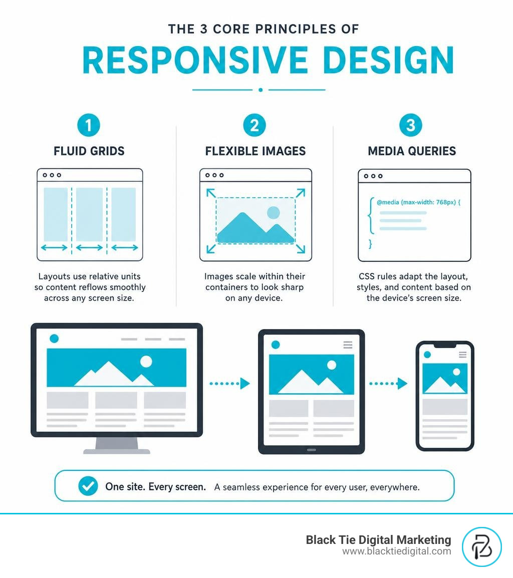
The real turning point came in 2010 when designer Ethan Marcotte coined the term in his legendary article on A List Apart. He argued that instead of creating separate, isolated experiences for every new device, developers should build websites that embrace the fluid nature of the web. He outlined a unified approach combining fluid grids, flexible images, and media queries.
By 2013, which Mashable famously declared the Year of Responsive Web Design, the industry had shifted its perspective. Building separate mobile sites was no longer sustainable. The ultimate validation of this shift came in 2015 when Google rolled out its mobile friendly ranking algorithm update, colloquially known in the industry as Mobilegeddon. Google began boosting the search engine rankings of mobile friendly websites when users searched from mobile devices, effectively making Responsive web design the gold standard for modern web development.
The Core Technical Pillars of Responsive Design
The magic of a responsive website relies on three technical ingredients working together in perfect harmony. When implemented correctly, these pillars ensure that your content flows naturally onto any screen.
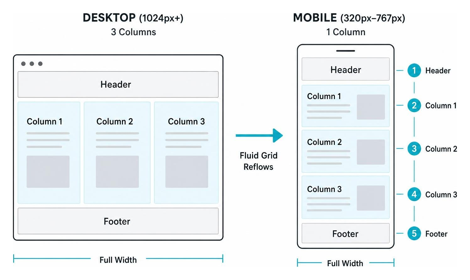
The first pillar is the fluid grid. Traditional web design relied on fixed pixel widths, which meant a layout built for a 960 pixel wide screen would simply overflow and create horizontal scrollbars on smaller screens. Fluid grids replace fixed pixels with relative units, such as percentages. Every element on the page is sized in proportion to its parent container. If a sidebar takes up thirty percent of the screen width, it will continue to take up exactly thirty percent whether the screen is three hundred pixels wide or three thousand pixels wide.
The second pillar is flexible images and media. If your layout is fluid but your images are fixed, a large image will quickly break your design by spilling out of its container. To solve this, developers use a simple but powerful CSS rule, setting the maximum width of the image to 100 percent and the height to auto. This tells the browser that the image should scale down proportionally if its container becomes smaller than the original width of the image, but it should never stretch larger than its original size.
The third pillar is media queries. Introduced in CSS3, media queries allow us to inspect the physical characteristics of the rendering device, such as its viewport width, resolution, or orientation. We can then write conditional CSS rules that only apply when certain conditions are met. For example, we can tell the browser to display a layout in three columns on screens wider than 1024 pixels, but collapse those columns into a single vertical stack on screens smaller than 768 pixels.
To make all of this work on mobile devices, we must use the viewport meta tag. By default, mobile browsers historically lied about their viewport width, assuming a standard desktop width of 980 pixels to render older desktop sites, and then scaling the page down so it looked like a tiny, unreadable postage stamp. The viewport meta tag tells the browser to set the width of the viewport to match the actual physical width of the device, using device independent pixels, and to set the initial zoom level to 100 percent.

To help understand how these approaches differ from other layout strategies, let us compare responsive design with adaptive design, which uses fixed layouts targeted at specific device sizes.
| Feature | Responsive Design | Adaptive Design |
|---|---|---|
| Codebase | Single fluid codebase | Multiple fixed layouts |
| Scaling | Smooth, continuous scaling | Snaps to specific widths |
| Maintenance | Easier, updates apply everywhere | Harder, must update multiple templates |
| Device Support | Future proof for all screen sizes | Requires new layouts for new sizes |
| Implementation | Uses percentages and media queries | Uses fixed pixel widths per breakpoint |
By focusing on a fluid foundation, we ensure that our custom website designs remain highly functional and beautiful, no matter what new devices hit the market. You can explore more about these core concepts in this guide on Responsive web design basics.
Modern CSS Layout Methods and Responsive Typography
As front end technology has evolved, the tools we use to build responsive websites have become incredibly sophisticated. We no longer have to rely on floats and clearfixes to build layouts. Modern CSS layout methods make creating flexible, responsive structures much easier and cleaner.
Responsive Design with Flexbox and CSS Grid
CSS Flexible Box Layout, commonly known as Flexbox, and CSS Grid are modern layout engines built from the ground up to be responsive. Flexbox is a one dimensional layout model, meaning it excels at laying out items in a single row or a single column. It allows items to expand to fill available space or shrink to prevent overflow, making it perfect for navigation bars, card layouts, and alignment.
CSS Grid, on the other hand, is a two dimensional layout system. It handles both rows and columns simultaneously, allowing you to create complex, magazine style layouts with ease. One of the greatest features of CSS Grid is the fractional unit, or fr. A fractional unit represents a fraction of the free space in the grid container. If you define a grid with three columns of 1fr each, the browser automatically divides the available space into three equal parts.
By combining CSS Grid with media queries, we can completely rearrange the visual structure of a website with just a few lines of code. For a comprehensive look at how these layout engines operate, check out the Responsive web design MDN documentation.
Responsive Design for Typography and Images
Responsive design is not just about moving boxes around, it is also about ensuring that your text remains highly readable and your images load quickly.
Typography can be made responsive by using viewport width units, where 1vw is equal to one percent of the viewport width. However, using viewport units alone for text size is a major accessibility risk because it prevents the user from being able to zoom in or out using their browser settings. To keep our designs accessible, we combine viewport units with fixed units like rems using the CSS calc function. This ensures that the text scales beautifully with the screen size while still allowing users to manually adjust the font size for readability.
For images, we must go beyond simple scaling to protect mobile performance. Serving a massive, high resolution desktop hero image to a mobile phone on a slow data connection is a recipe for a high bounce rate. We use the picture element and the srcset attribute in HTML to serve different image files based on the screen size. This allows us to serve a lightweight, cropped image to a smartphone and a gorgeous, full resolution image to a 4K desktop monitor.
Our team discusses these visual strategies in detail in our article, Black Tie Explains Responsive Design.
Strategic Approaches to Multi Device Layouts
When planning a custom website design, there are two primary design philosophies: desktop first and mobile first.
Historically, designers started with the desktop version of a website and then figured out how to shrink, hide, or rearrange elements for smaller screens. This is known as graceful degradation. Today, we strongly advocate for the mobile first approach, which is a form of progressive enhancement.
Mobile first design forces us to focus on what is absolutely essential. Because screen space is limited on a smartphone, we must prioritize the core content and user actions first. Once the mobile layout is solid, we use media queries to progressively enhance the design, adding secondary features, larger visuals, and multi column layouts as the viewport expands.
For some complex applications, a purely client side responsive approach might not be enough. This is where RESS, or responsive web design with server side components, comes into play. RESS combines the flexibility of a single responsive codebase with server side optimization. The server detects the device and pre processes certain assets, such as heavy widgets or complex navigation, before sending the optimized HTML and CSS to the client. This offers the best of both worlds, a single codebase to maintain, and a highly optimized, lightning fast experience for mobile users.
To learn more about how a mobile first strategy can transform your business, read about the 5 Important Things to Know About Responsive Design and explore the original philosophy behind the movement in Responsive Web Design A List Apart.
Overcoming Challenges and Testing Responsive Layouts
While responsive design is incredibly powerful, it does come with its own set of challenges. The most significant challenge is performance. Because a responsive site serves the same HTML document to all devices, mobile users can end up downloading CSS and JavaScript that is only used on the desktop version. We address this by optimizing our assets, using modern image formats like WebP, and lazy loading offscreen images.
Another common issue is layout shifts, which happen when elements move around as the page loads, causing users to accidentally click the wrong buttons. This is easily solved by reserving space for images and media by declaring their width and height attributes directly in the HTML.
To ensure that our custom website designs work flawlessly, we must test them rigorously. We use browser developer tools, such as Chrome DevTools, to simulate various device viewports, inspect media queries, and test touch interactions. While device simulators are fantastic for rapid testing during development, they cannot fully replicate the performance, latency, and hardware limitations of real devices. That is why we always perform real device validation on actual smartphones and tablets before launching any website.


Testing ensures that the user journey remains smooth and intuitive, regardless of the connection speed or device. For a deeper dive into the technical challenges of responsive layouts, read our detailed post on 5 Important Things to Know About Responsive Design.
Frequently Asked Questions About Responsive Design
What is the difference between responsive design and mobile first design?
Responsive design is the technical execution of using fluid grids, flexible images, and media queries to make a website adapt to any screen size. Mobile first design is a strategic design philosophy where you start the design and development process with the smallest screen size first, then progressively enhance the experience as screen sizes grow.
Why is the viewport meta tag necessary for mobile rendering?
Without the viewport meta tag, mobile browsers will assume they are rendering a desktop website and default to a viewport width of 980 pixels. This causes the entire website to scale down, making text microscopic and forcing users to pinch and zoom. The viewport meta tag forces the browser to render the site at the actual physical width of the device.
How do media queries and breakpoints work together?
Media queries are the CSS rules that allow us to apply styles conditionally based on the screen width. Breakpoints are the specific pixel or rem values where the layout changes. Instead of targeting specific device models, we set breakpoints where our content naturally starts to look crowded or broken, ensuring a seamless experience across all viewports.
Conclusion
In 2026, a website is often the very first interaction a customer has with your business. If your site is slow, difficult to navigate, or broken on mobile devices, you are turning away valuable leads. Building a beautiful, highly functional, and fully responsive website requires a strategic partner who understands both the art and the science of the modern web.
At Black Tie Digital Marketing, we are a full service digital marketing agency serving clients in Orlando, Melbourne, and throughout Central Florida. Our unique agency quality is our custom website design process. We specialize in high end WordPress websites built entirely from scratch, with absolutely no templates or premade themes. This ensures your website is uniquely tailored to your brand, lightning fast, and fully optimized for search engines.
Our leadership team, including CEO Scott Brazdo, brings deep industry expertise to every project. Scott led the comprehensive rebrand for KelTec and led the strategic marketing work for B5 Systems, demonstrating our capability to support elite brands, including our heroes in the firearms manufacturing industry.
Are you ready to elevate your online presence with a stunning, high performance website built from the ground up? Let us show you how we combine the power of ten traditional vendors into one innovative partner. Contact us today to start your journey toward a truly custom website design.