
Responsive Website Layouts That Bend, Not Break
Master responsive website layout techniques that adapt perfectly across every device, boost SEO, and deliver flawless user experiences.
Why Your Website Needs a Responsive Layout in 2026
A responsive website layout is how modern sites automatically adjust their design to fit any screen size, from a small phone to a large desktop monitor.
Here is what a responsive website layout includes:
- Fluid grids: Columns and rows that resize using percentages instead of fixed pixels
- Flexible images: Media that scales down (or up) to fit its container without breaking
- Media queries: CSS rules that apply different styles at specific screen width breakpoints
- Viewport meta tag: A line of code that tells mobile browsers how to scale the page correctly
- Mobile first approach: Designing for the smallest screen first, then expanding for larger ones
Think about the last time you tried to read a website on your phone and had to pinch and zoom just to see a button. That frustrating experience is what happens when a site is not built to adapt.
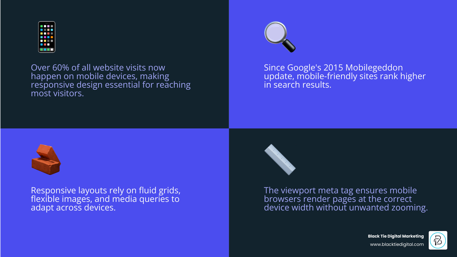
Here is why this matters right now. Over 60% of all website visits happen on mobile devices, not desktops. That means the majority of your potential customers are seeing your site on a small screen. If your layout does not flex to meet them there, you are losing them before they even read a word.
Responsive design is not a trend. Since Google’s 2015 “Mobilegeddon” update, mobile friendliness has been a direct ranking factor. A site that breaks on mobile does not just frustrate visitors. It quietly disappears from search results.
As Scott Brazdo MBA, CEO of Black Tie Digital Marketing and a brand strategist with over 20 years of experience redesigning more than 500 companies’ digital presence, I have seen how a poorly structured responsive website layout can undermine even the strongest brand. In the sections below, I will walk you through exactly how responsive layouts work and how to get them right.
The Core Components of a Responsive Website Layout
The term “responsive web design” was coined by Ethan Marcotte in 2010, but the philosophy has evolved significantly as we move through 2026. At its heart, a responsive website layout is about creating a user experience that feels native to whatever device a person chooses to use. Whether someone is browsing from a high end laptop in Orlando or a smartphone while walking through Melbourne, the site should feel intentional.
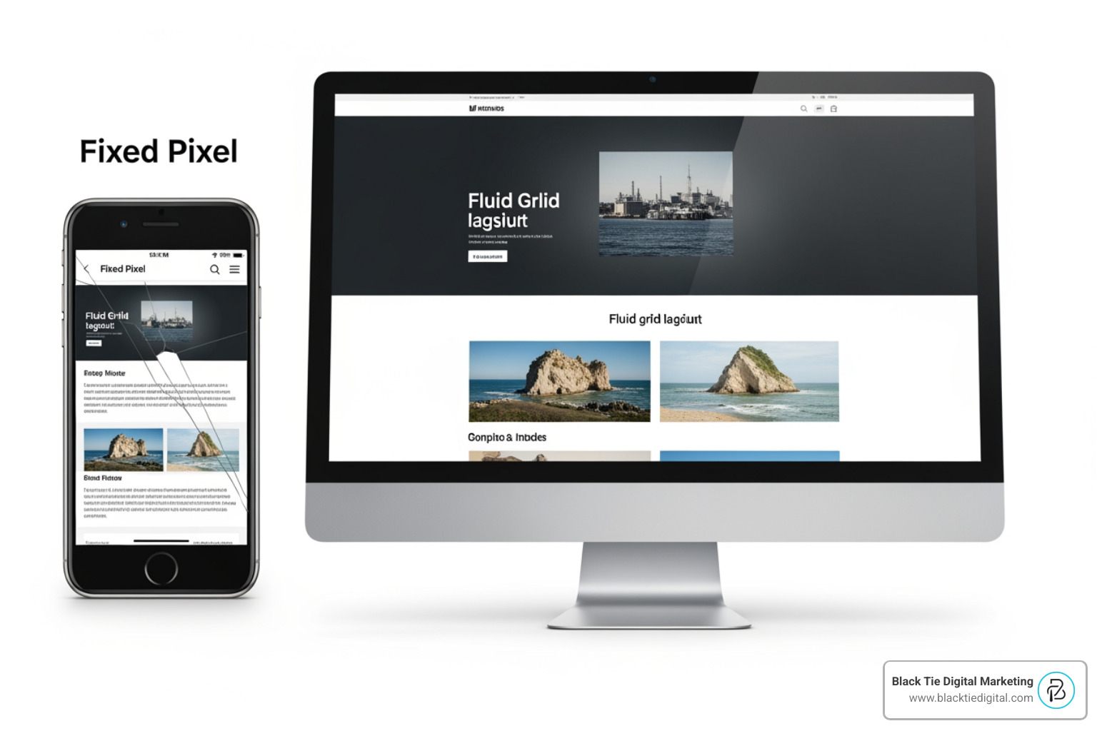
To achieve this, we rely on three technical pillars. First are fluid grids, which use relative units like percentages instead of fixed pixels. If a sidebar is set to 25 percent width, it stays 25 percent width whether the screen is 400 pixels or 4000 pixels wide. Second are flexible images that never exceed the width of their container. Third are media queries, the “brain” of the operation that tells the site when to switch from a three column view to a single column stack. You can explore more about these fundamentals in our guide on 5 Important Things to Know About Responsive Design.
The Viewport Meta Tag and Scaling
Before we even get to the pretty colors and fonts, we have to talk about the viewport meta tag. This is a tiny but mighty line of HTML code that lives in the “head” section of your website. Without it, mobile browsers will assume your site is a giant desktop page and try to shrink the whole thing down to fit the screen. This results in microscopic text and tiny buttons.
By using the viewport tag, we tell the browser to match the website’s width to the physical width of the device. It looks like this: . This simple instruction ensures that a phone treats its 390 pixels of width as the actual canvas, allowing our responsive styles to kick in properly. Ensuring your site handles this correctly is the first step toward a mobile friendly website.
Breakpoints and Media Query Strategy
Media queries are the conditional statements of the web design world. They allow us to say, “If the screen is wider than 768 pixels, show the sidebar. If it is narrower, hide it.” We call these specific transition points “breakpoints.”
In 2026, we avoid picking breakpoints based on specific phone models because new devices come out every month. Instead, we use relative units like em or rem for our queries. This ensures that if a user increases their default font size for accessibility, the layout responds gracefully. Modern tools like Tailwind CSS provide excellent frameworks for managing these variants, helping us build interfaces that adapt to any resolution from a smartwatch to a 4K television.
Modern CSS Architecture for Adaptive Interfaces
The way we build a responsive website layout has changed. We no longer rely on “hacks” or complex math to position elements. Modern CSS provides us with powerful layout engines that do the heavy lifting for us.
| Feature | Flexbox | CSS Grid |
|---|---|---|
| Dimension | One-dimensional (Row or Column) | Two-dimensional (Rows and Columns) |
| Best For | Aligning items in a bar or list | Building the overall page structure |
| Logic | Content-first (items grow/shrink) | Layout-first (items fit into a grid) |
| Alignment | Excellent for centering items | Excellent for complex overlapping |
Using a CSS Layout Generator can help visualize how these structures work in real time, allowing us to create “Holy Grail” layouts that include headers, sidebars, and footers that reorganize themselves automatically.
Flexbox and CSS Grid in a Responsive Website Layout
Flexbox is our go-to for smaller components. If you have a navigation bar where you want the logo on the left and links on the right, Flexbox handles the spacing and alignment perfectly. It is “content-aware,” meaning it knows how much space an item needs and can wrap items to a new line if the screen gets too tight.
CSS Grid, on the other hand, is the master of the overall page architecture. We can define “grid template areas” with names like “header,” “main,” and “footer.” When the screen size changes, we can simply tell the CSS to move those areas around. A sidebar that sits on the right on a desktop can be moved below the main content on a phone with just one line of code. We dive deeper into these technical nuances in our post where Black Tie Explains Responsive Design.
Container Queries and Component Level Control
One of the most exciting breakthroughs in recent years is the rise of container queries. Traditionally, media queries only cared about the size of the whole browser window. But what if you have a “card” component that needs to look different depending on whether it is in a wide sidebar or a narrow column?
Container queries allow a component to look at its parent container instead of the whole screen. This creates “micro layouts” that are truly modular. If you move a piece of content from the main section to a small widget area, it will automatically adjust its own internal layout to fit. This level of control is highlighted in the modern web guidance from Google Chrome, and it is a game changer for building complex, scalable design systems.
Optimizing Media and Typography for Every Screen
A responsive website layout is not just about moving boxes around. It is also about ensuring that the content inside those boxes is readable and fast.

Images are often the heaviest part of a website. If you load a 4000 pixel wide photograph on a smartphone, you are wasting the user’s data and slowing down their experience. We use the picture element and the srcset attribute to serve different image files based on the screen size. A phone gets a small, compressed version, while a retina display gets the high resolution original. This same logic applies to video, ensuring marketing videos are mobile friendly by preventing them from overflowing their containers or auto-playing with sound when it might annoy the user.
Responsive Typography with Viewport Units
Text needs to be legible regardless of the device. If your font is too small on a phone, people will leave. If it is too large on a desktop, it looks unprofessional. We use CSS functions like clamp() to set a minimum, preferred, and maximum size. For example, font-size: clamp(1rem, 5vw, 2.5rem) tells the browser to keep the text between 16 pixels and 40 pixels, scaling it smoothly in between based on the viewport width.
This fluid typography ensures that your headlines always look balanced. It removes the need for dozens of tiny media queries just to nudge a font size up or down. As we often say, mobile matters, and typography is the primary way your brand speaks to its audience.
Navigation Patterns and Touch Targets
The way we interact with a site changes when we move from a mouse to a thumb. On a desktop, a hover menu might work fine. On a smartphone, that same menu is impossible to use.
Responsive navigation often involves the “hamburger menu,” a three line icon that expands into a full screen overlay. However, in 2026, we also focus on the “thumb zone,” keeping important buttons within easy reach of a user’s thumb at the bottom of the screen. We also ensure that all interactive elements are at least 44 by 44 pixels to prevent “fat finger” errors. Frameworks like Bootstrap provide pre built, accessible components that handle these transitions automatically, ensuring your site remains functional for every user.
The Strategic Impact on SEO and Performance
At Black Tie Digital Marketing, we do not just build sites because they look good. We build them to perform. A responsive website layout is a foundational requirement for modern Search Engine Optimization (SEO).
Since Google moved to mobile first indexing, their “crawler” looks at the mobile version of your site to determine your ranking. If your mobile layout is missing content that exists on the desktop version, or if it takes too long to load, your rankings will suffer. High bounce rates (people leaving your site immediately) are often caused by poor mobile experiences. If a user in Central Florida searches for your services and finds a broken layout, they will click the “back” button and go to a competitor. This is why asking if your website works on mobile devices is one of the most important questions you can ask for your business.
Mobile First Indexing and Search Visibility
The shift to mobile has been years in the making. We saw smartphones tip past 50 percent of mobile traffic a decade ago, and that trend has only accelerated.
Google’s algorithms prioritize sites that offer a fast, seamless experience across all devices. When your site is responsive, you have one URL and one set of HTML code. This makes it easier for search engines to crawl and index your content compared to having a separate “m.website.com” mobile site. It also ensures that any backlinks or social shares point to a single location, concentrating your “SEO juice” rather than splitting it between two versions of the same page.
Enhancing Accessibility within a Responsive Website Layout
Accessibility is not an afterthought; it is a legal and ethical necessity. A truly responsive site must be usable by people with disabilities. This means using semantic HTML (like , and ) so that screen readers can navigate the page.
We follow the WCAG 2.1 guidelines to ensure that our layouts are not just visually flexible but also technically robust. This includes maintaining a logical tab order for keyboard users and ensuring that color contrast remains high across different screen brightness levels. When a layout “bends” for a smaller screen, it must also stay organized for someone using assistive technology.
Frequently Asked Questions about Responsive Design
What is the difference between responsive and adaptive design?
Responsive design uses a single layout that fluidly adjusts to any screen size using percentages and media queries. Adaptive design uses several fixed layout templates (e.g., one for desktop, one for tablet, one for phone) and serves the one that most closely matches the user’s device. Responsive design is generally preferred because it covers “the in-between” sizes and is easier to maintain.
Why is the viewport meta tag necessary for mobile devices?
Mobile browsers were originally designed to show desktop websites. To do this, they “lie” to the website and say they are 980 pixels wide, then zoom out to show the whole page. The viewport meta tag tells the browser to stop lying and use the actual device width, which allows our responsive CSS to scale elements correctly for the small screen.
How many breakpoints should a modern website use?
While there is no magic number, most modern sites use at least three to five breakpoints. Common targets include mobile (around 480px), tablet (around 768px), and desktop (above 1024px). However, the best practice is to add a breakpoint whenever the layout starts to look “squished” or “broken” as you resize your browser window.
Conclusion
Building a responsive website layout is about more than just checking a box for Google. It is about respecting your audience. Whether your customers are in Orlando, Melbourne, or anywhere in Central Florida, they deserve a website that works perfectly the first time they visit, regardless of the device in their hand.
At Black Tie Digital Marketing, we specialize in creating digital experiences that combine technical excellence with strategic branding. A responsive layout is the backbone of that experience. By investing in a flexible, future proof design, you benefit from:
- Lower maintenance costs: One site to update instead of two.
- Improved SEO: Better rankings through mobile first indexing.
- Higher conversion rates: A smoother path to purchase for mobile shoppers.
- Brand consistency: Your business looks professional on every screen.
If your current website feels rigid or breaks when you view it on your phone, it is time for a change. We invite you to partner with us for Custom Web Design and let us build a site that bends to your customers’ needs without ever breaking your brand.
